The solution
A new design using automated data allowed us to quickly generate reports for hundreds of categories (and growing), with little to no manual input required. The new design has a more branded presence throughout the site, while our vendors appreciated the increased recognition.
Key Results
Enabled the automated generation of over 500 new reports
Users who viewed the report were several times more likely to convert—even higher than the previous Top 20 reports
Improved page speed, SEO, and EAT while maintaining a low bounce rate
Capterra is a part of Gartner Digital Markets, whose goal is to provide a frictionless way to connect software buyers to the right solution. Users can read verified reviews, read buying guides, and compare software to make a better informed decision.
Setting expectations
The initial ask from the stakeholder was to completely redesign and launch the report in ~30 days. This would not have allowed us to achieve the results we wanted and likely would have resulted in a missed deadline. Instead, I convinced key stakeholders to extend the time to ~3 months to allow for research, prototype testing, and finally development (approx. 1 month for each phase). I also requested some bandwidth from my design team co-lead to partner on the first two phases.
Fortunately, there was little to no resistance to the new plan so we immediately got to work on phase 1.
Background
The majority of our users are small business owners facing an issue they hope to resolve with the right software. They've generally come to us via Google, and if they aren't already overwhelmed by the amount of options, they soon will be. For example, the CRM category alone has over 1,600 options available.
Users are often anxious from the staggering amount of options. This anxiety is then compounded by a general uncertainty about how to properly evaluate the options. This makes it impossible to confidently choose the best solution for their needs.
To me, the software buying process is the perfect representation of Hick's Law which states that "the time it takes to make a decision increases with the number and complexity of choices". This effectively established the top two priorities for the Capterra Shortlist: first, reduce the number of choices by highlighting a curated list. Then, simplify the complex task of software comparison into a more streamlined and understandable process.
This takes our users on a journey from anxiety and apprehension before finding us, into a "wow" moment when they discover the Shortlist, which then becomes a sense of relief, and finally becomes confidence.
"Wow, they've done so much of the work for me"
"This makes it so much easier"
"I know which one is for me"
(While the above is a slight dramatization, 2 of the 3 quotes were directly pulled from user interviews).
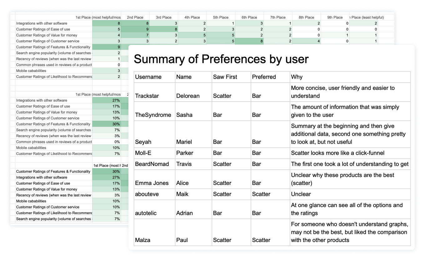
Initial Research
The initial research set out to discover what data users found most valuable when comparing software. Additionally, we wanted to validate two stakeholder assumptions/directives:
1) The list view was problematic.
2) There should only be 3-4 products listed.
We used this information to map the data we had to what users found most useful, and as the direction for the two competing layouts we would test in the prototype phase.
Prototype phase
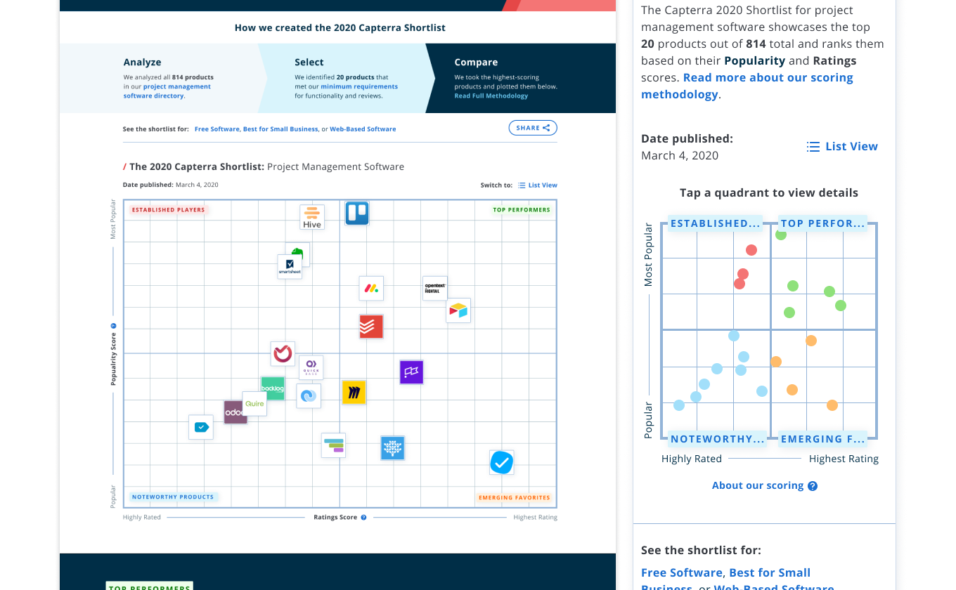
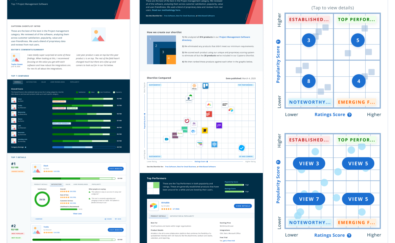
We did several rounds of head-to-head prototype testing before arriving at our final solution. In short, the Magic Quadrant had the biggest impact on our EAT score, the vendors preferred this to a list view which only highlights the top 1 or 2 products, and it was more closely tied to Gartner's magic quadrant (which was important to many stakeholders and from a general branding perspective). Many users liked the list view, so we included it as a toggle so they can use whichever they respond to best.
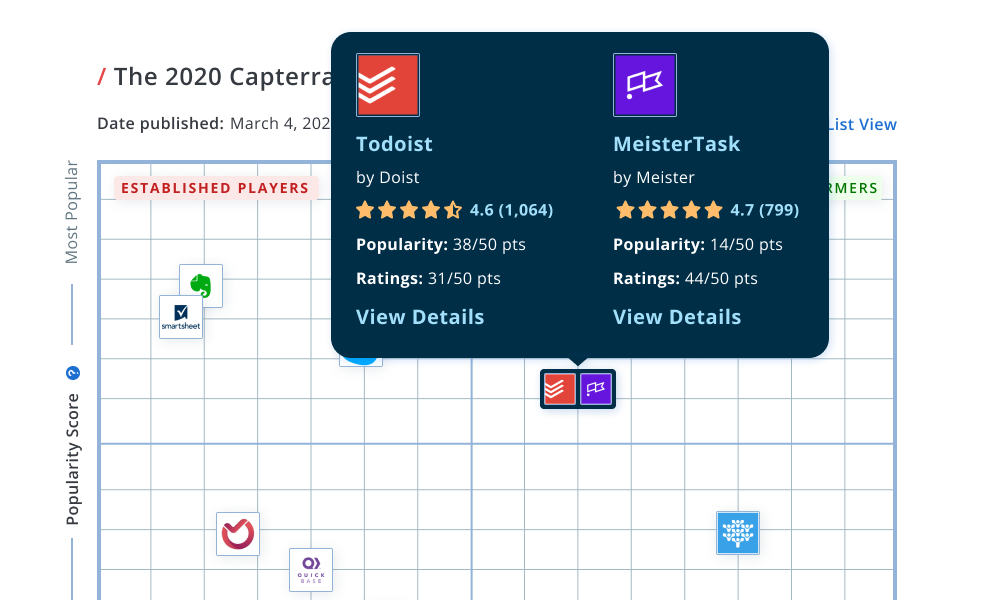
Grid clustering issue
One challenge we faced was how to handle two or more products occupying the same space within the grid. Vendors would understandably be upset if a competitor was covering their logo, so we needed a solution that treated them all equally. We established that a vast majority of the time it would only be 1 or 2 products that would potentially overlap, so we tested several ideas before arriving at the one above.
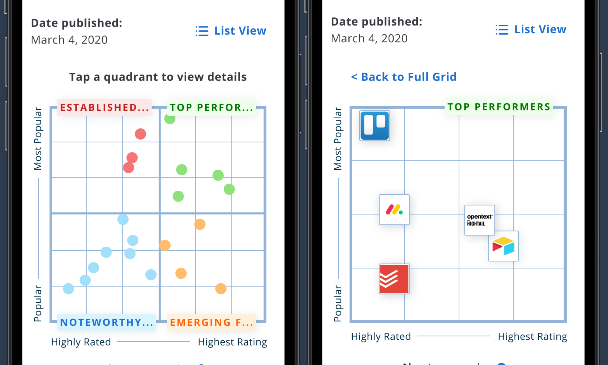
Quadrant view on mobile
The biggest challenge with the Magic Quadrant was providing an equitable experience on mobile. The smaller space means that logos were guaranteed to overlap which would again upset vendors, but also be impossible for mobile users to navigate and parse the information. Changing the default view to show color coordinated dots, and allowing users to "zoom in" to each quadrant allowed for a seamless experience while navigating the grid. As an additional precaution, we did default to the list view on mobile which was our users' preferred mobile experience.
View prototype of mobile animation