The solution
I worked with an engineering counterpart to establish a design system team (which would later broaden in scope to include more over arching user experience improvements). We successfully created and launched an entirely new design system with robust documentation, streamlined processes, with flexible and accessible components and patterns. I built the foundation for a new culture of “accessibility as default” that included education, evangelism, documentation, and an internal audit process.
Key Results
100% of squads adopted the new design system
Improved consistency, and faster feature development
Established a new culture of accessibility and audit process
View Figma file
Unfortunately for various reasons I cannot share the H1/U1 design system as a whole, but you can view excerpts in Figma below:
View H1/U1 snippets
Lay of the land
It’s impossible to create a design system without a deep understanding of the context and users that you’ll serve. Naturally the first step was to meet as many people I could and ask a thousand questions. A major focus was on the technical stack and how things are built, released, and updated. Then I conducted an audit of the existing pattern library and product itself to identify areas of inconsistency and general opportunities.
User interviews
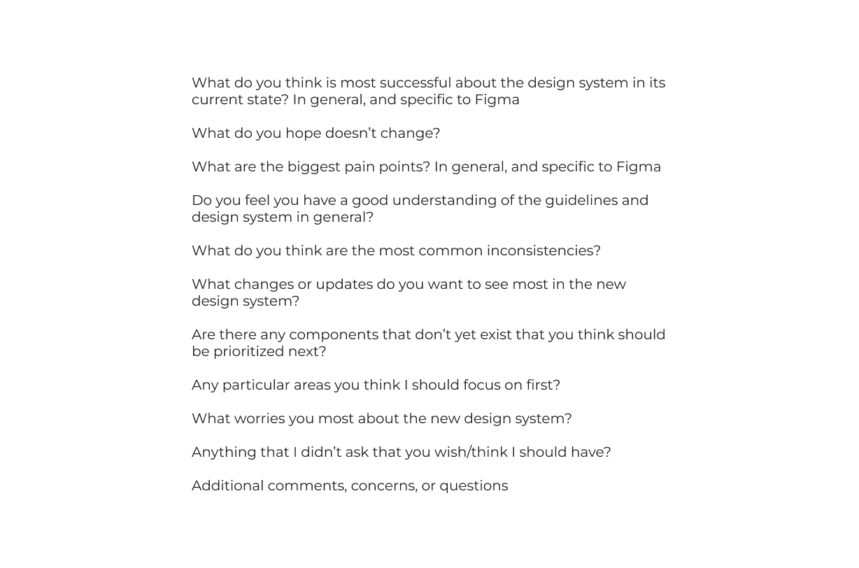
I then conducted user interviews with the designers and engineers with questions based on the understanding I had so far. The questions focused on the perceived current pain points, hopes and fears for the new system, what they saw as highest priority, and more.
Departures and uncertainty
This was never officially confirmed, but I’m convinced that the departure of a specific engineer about a month and a half into my tenure caused a couple key stakeholders to reevaluate the design system effort as a whole. As you would expect, this threw a bit of a wrench into the plans and meant we had to pivot to reestablish that trust.
There are plenty of articles that speak to the value of a design system, but in my experience sometimes stakeholders need to see it to truly understand it. My engineering partner and I proposed a pilot squad to prove out the value a design system with the hopes the squad will become permanent.

Pilot project
The best way to demo the design system was a live pilot project. We decided to redesign the notifications page due several reasons:
- It was the most out of date page in the product (see #2)
- It was a low-priority (read: low-risk) page, with no specific owner
- The engineering difficulty was lower than most other pages
Long story short, not only was the pilot project a success, the stakeholders were very impressed with how we functioned as a team which allowed us to expand the size and scope of our now permanent team. The two of us became 4 engineers, 1 engineering manager, and 1 designer (myself) with talks of adding more designers later. We also adopted a new name PIXL with a mascot to boot.
Pilot squads & ambassadors
After our pilot proved successful, it was time to identify a new pilot squad. One squad was particularly excited to participate which made our choice an easy one. This squad would serve to test the components and structure as is, while providing invaluable feedback as we got it off the ground. This was one of the most important steps we took to ensure better adoption later.
In addition to the pilot squads, we recruited design system “ambassadors”—one from each squad—to act as a liaison between our squad and their rest of the organization. We would meet regularly to discuss strategy, direction, and continually validate that our roadmap aligned with their priorities.
Metrics & prioritization
A challenge for any design system is creating measurable success metrics. While you can track how often components are used in Figma, or how many are used in code, there are too many other mitigating factors that can muddy the data. That said, those are still important so you don't want to ignore them but we wanted more ways to track adoption.
I firmly believe that adoption is the most important metric for a design system. To that end, each quarter we had a goal to increase the number of squads using the design system by XX% (varied by quarter). By the end of my tenure, we went from 0 squads using the design system to 100% squad adoption.
Another challenge for design systems is knowing how to prioritize and plan updates/releases. At a high level, the best way to solve this is frequent and open communication. We would proactively reach out to our pilot squads, design system ambassadors, and other interested parties to keep a running list of what’s coming up and how we can best support their goals. I also sent out quarterly surveys to our users to rank the most important upcoming components/features.
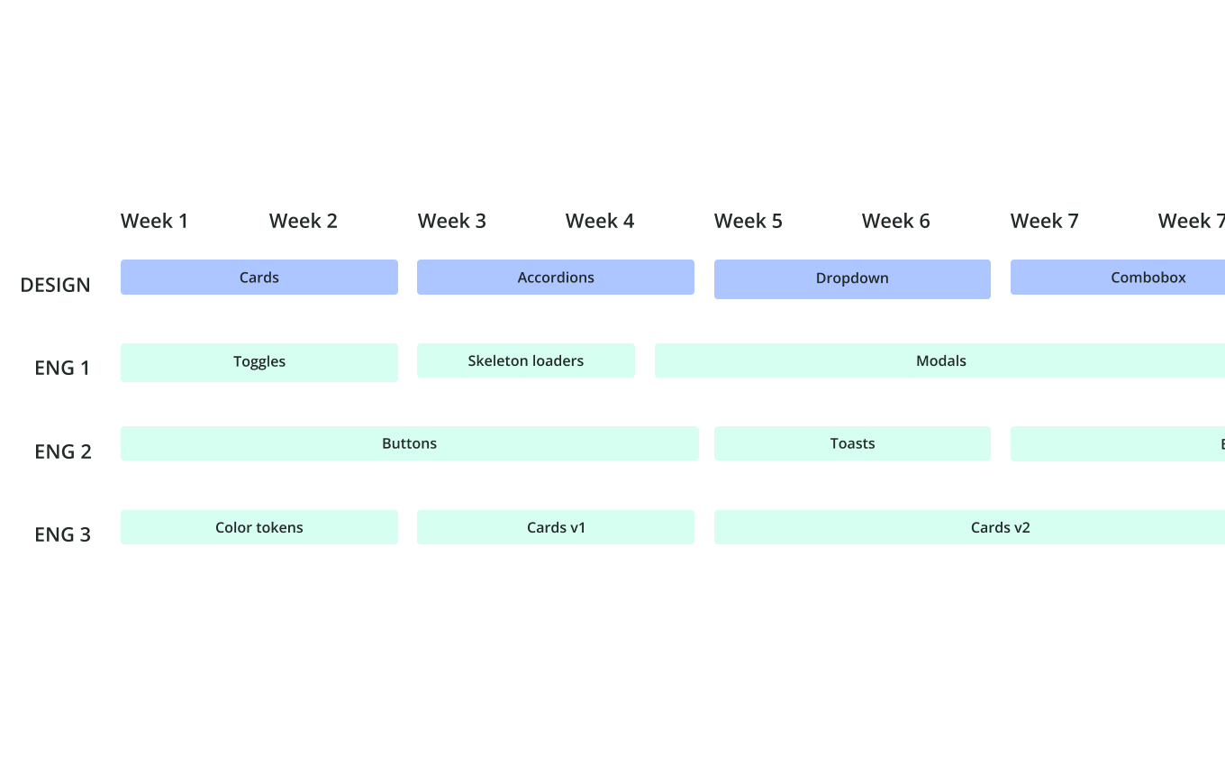
We also had to balance that with our squad’s bandwidth. We took the information from our conversations, office hours, and surveys to create a prioritized list. Then we reviewed and estimated the effort at a high-level for each. With that, I created a Gantt chart to best balance priority and developer bandwidth.
Centralizing the documentation
Our design system started off split in half between Figma and Storybook (for designers and engineers respectively) as I imagine most young design systems are. But fragmented documentation complicates—if not actively harms—overall adoption. Not only that, but any changes to Storybook required 2 (or more) engineers to make a simple change which often took at least an hour between the different PRs, reviews, and coordination. Like the design system itself, we wanted our documentation to be dynamic.
My engineering partner and I kicked off a search early on to find a better solution for a more centralized documentation tool. After much research and a few demos/trials, we decided to use Zeroheight as our solution. A major plus was the additional analytics built-in that would provide more opportunities to track success metrics.
Collaboration and building components
When most people think about design systems, components are the first thing to come to mind. Throughout the entire process, I was building and updating components, writing documentation, and creating collaborative processes. I established a monthly demo and office hours for the design system squad (PIXL). I also had semi-weekly office hours for the designers. We regularly conducted informative talks (lightning talks) to the broader product team.
You can read more about the process in the article I wrote:
Consensus building in a digital first world
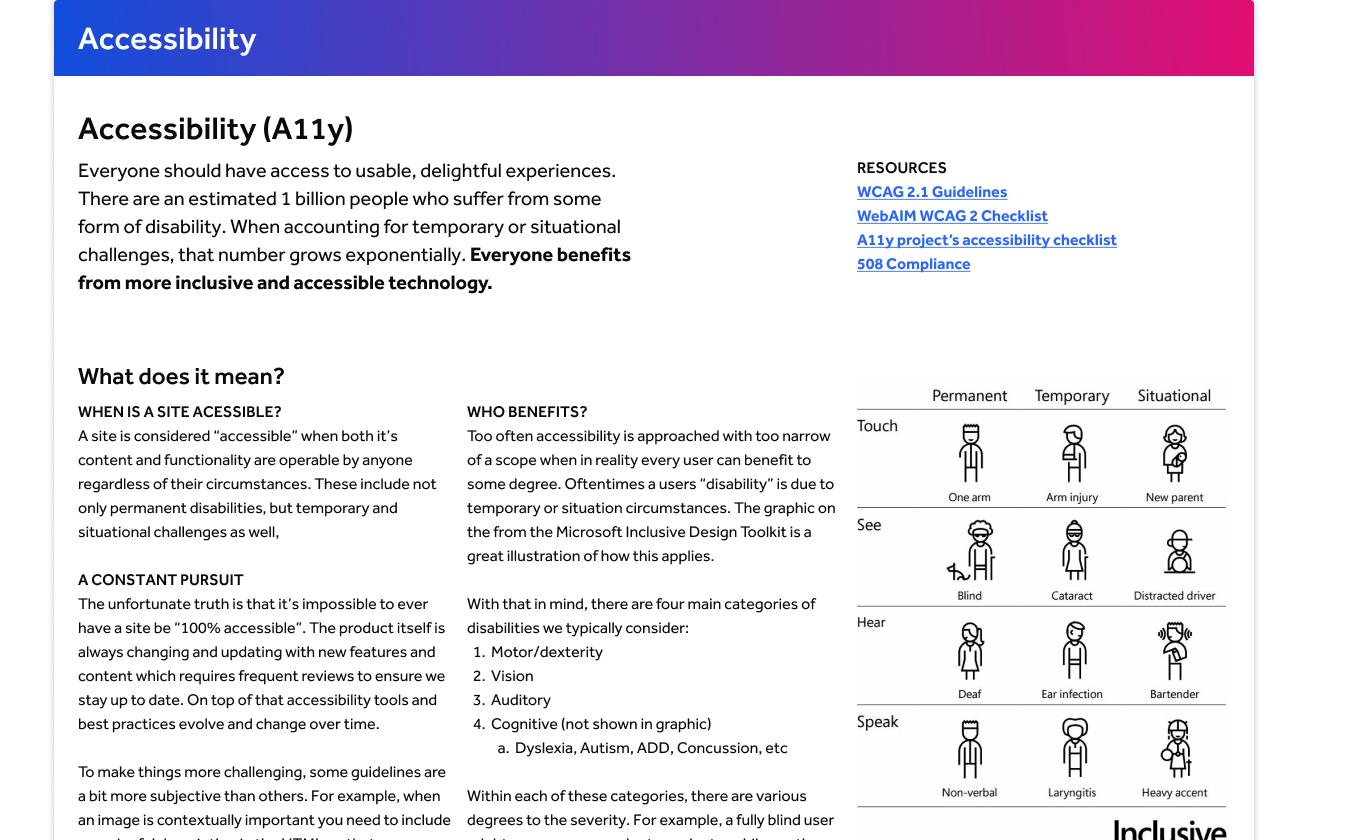
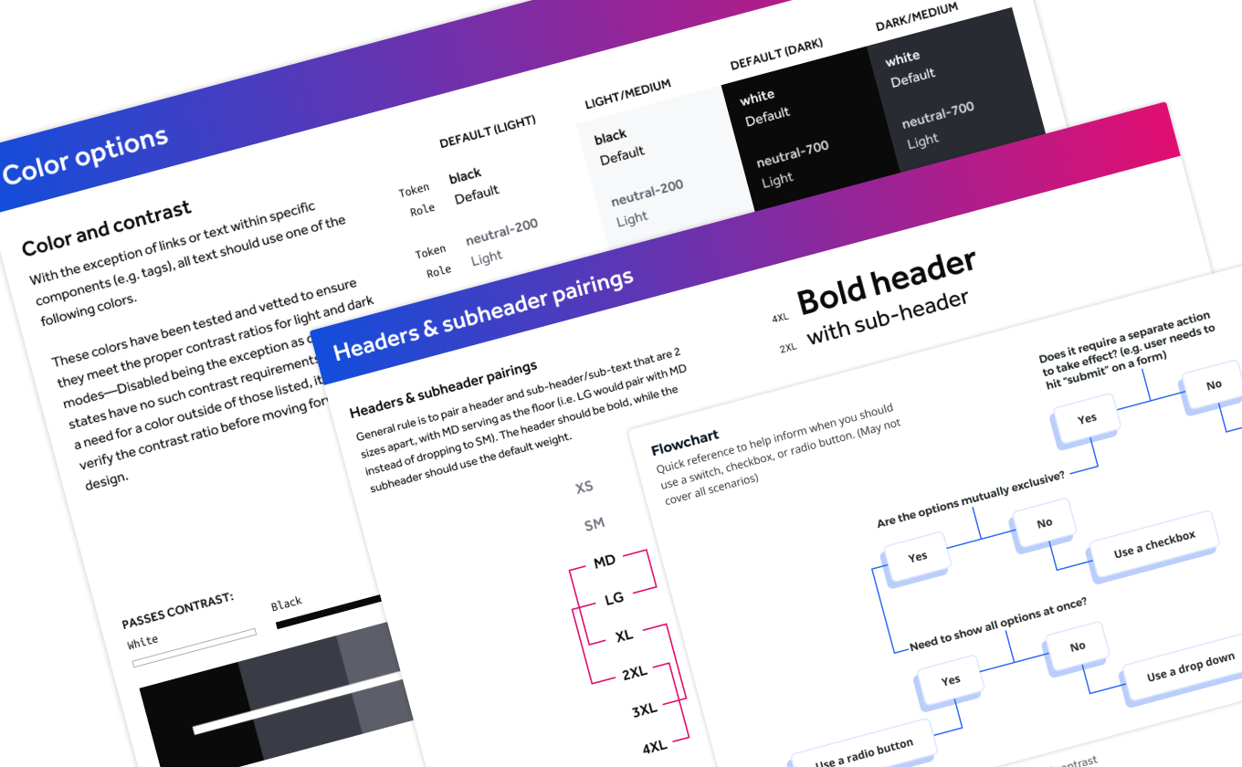
Accessibility
I've always been an advocate for accessibility. However we were also required to maintain WCAG AA standard to be compliant with our clients' policies. At the time there was no owner for the accessibility space, so I saw an opportunity to step into that role.
I gave a presentation at our company wide all hands meeting on the importance, and a high level overview of accessibility. While there was a lot of enthusiasm afterwards, there was also a lack of understanding of how we get there and how to track our current status.
For the design system itself, I ensured each component was developed to be “accessible by default”. This meant that the default state of any component will pass any related accessibility requirements, the variants or customization options had guardrails to maintain compliance, and embedded warnings against possible violations. Not every accessibility issue can be prevented this way, but it can get you most of the way there.
Additionally I created documentation about the overall accessibility principles, along with component specific documentation for each component. I believe it’s incredibly important to have the “why” readily available for the inevitable scenarios where a design/accessibility conflict arises.
Finally, I worked with a PM, engineer, and UX writer to create an audit process for us to run internally to better understand our current status. At one point we had used a third party solution to perform the audit, but that had stopped and no one seemed to know why. We planned to resume the third party audits on a yearly basis, while the internal audit provided a rolling buffer in between.